Welcome to Your Daily Spot! Support us and become a Pro.
  Your Daily Spot
  Your Daily Spot
  • Hub
    • Animes
    • Cartoons
    • Tech
  • Apps
  • Video Games
    • Action
    • First-Person Shooter >
      • Call Of Duty Tips & Tricks
      • Destiny
      • Call of Duty®: Advance Warfare
      • Counter Strike >
        • CS:GO Video
    • Racing
    • Simulation
    • Sports
    • Strategy
    • Online Games >
      • MapleStory
    • Vainglory >
      • Find Allies
      • ShinKaigan
  • News
    • Apple
    • Entertainment
    • Gaming
    • Tech
  • About Us
    • Blog
    • Partners >
      • Apply
  • Contact
    • Team
    • Discord
  • Upcoming
  • Deals
  • Pro

Headline of The day!

The Russian World Cup logo looks like a bug-eyed alien

11/4/2014

Comments

 
Picture
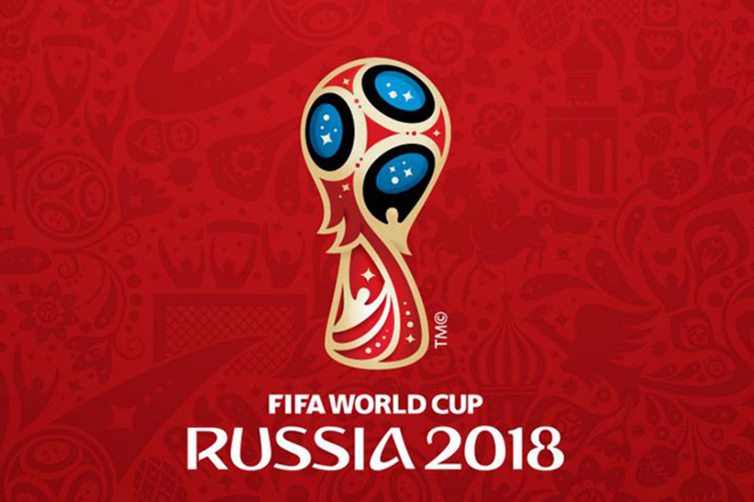
This week, the internet has found some time away from quarrelling with itself over GamerGate to try and figure out exactly what the logo for the next soccer World Cup is meant to represent. To hear it described by the Russian hosts and the Portuguese designers at Brandia Central, it's an amalgamation of the host nation's proud traditions in art, architecture, and space exploration, mixed in with some symbology about the human aspiration to reach for the stars. Those themes are subtly woven in by using Sputnik's shape at the top of the design and ascending human figures at its base. Perhaps toosubtly. The immediate reaction has been to variously compare the new logo to Roger the Alien from American Dad!, the Powerpuff Girls, a three-headed electric shaver, or to Edvard Munch's famous painting The Scream.

Edvard Munch is the man behind the #Russia2018 logo, apparently. pic.twitter.com/UpH0SoVA6m

— Lee Thomas-Mason (@LeeThomasMason) October 29, 2014
That response has obviously not been the one anticipated by the Russia 2018 organizers, who have gone to great lengths to give the new logo a grand reveal. It was unveiled by Russian astronauts from aboard the International Space Station and later projected onto the facade of the world-famous Bolshoi Theatre in Moscow. Still, if there's been one consistent theme to big international sports tournaments in recent times, it's been widespread derision for their logos — and while Russia's effort might be imperfect, it looks a great deal better than the London 2012 brand that was draped like a bad suit over the most recent summer Olympics.

Turn the new #Russia2018 World Cup logo on it's side and... #FindingNemo pic.twitter.com/OMG8HKMfLX

— Conor McNamara (@ConorMcNamaraIE) October 29, 2014
© 2014 http://www.theverge.com/tldr/2014/10/31/7137021/russia-2018-world-cup-logo
Comments
comments powered by Disqus

    Headlines


    Picture
    Instagram launches redesigned app and icon
    Picture
    Warner Bros. will release 35 4K Blu-ray movies this year in glorious HDR
    Picture
    Samsung's new Tizen-powered remote could rule your smart home
    Picture
    FAA announces drone owners must register by February 19th, 2016

    Archives

    May 2016
    January 2016
    December 2015
    September 2015
    August 2015
    July 2015
    June 2015
    May 2015
    April 2015
    March 2015
    February 2015
    January 2015
    December 2014
    November 2014
    October 2014
    September 2014
    August 2014
    July 2014

    Categories

    All
    4K
    5K
    Anime
    Apple
    Apple Music
    Apple Watch
    Apps
    Entertainment
    Ferrari
    Funny Videos
    Gear S
    Google
    Headline
    HP
    IMac
    IOS
    IPad
    IPhone
    Lamboghini
    Microsoft
    Nexus
    Nokia
    OS X
    Pranks
    Samsung
    Samsung Galaxy
    Sony
    Tech
    Tech Toys
    TV
    Video Games
    Vizio
    Windows 10
    Xiaomi

Copyright © 2014-2016 Your Daily Spot. All Rights Reserved.
v2.1.4 August 11, 2015
Terms of Service
Sitemap