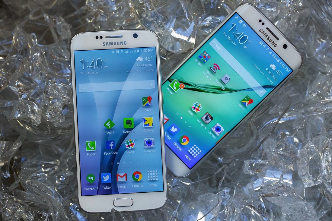
Now that Apple is finally making big phones, and even the cheapest Android phones feel nice, we all expect more from Samsung — and rightly so. A flagship phone has to be great or it’s going to get laughed out of the room. If the Galaxy S6 was another plasticky, boring phone like last year’s Galaxy S5 or if it merely introduced a few hardware tricks, it would have gotten laughed out of the entire neighborhood.
The Galaxy S6 is what happens when Samsung doesn’t try to copy Apple’s phones, but instead finally tries to copy Apple’s product philosophy.
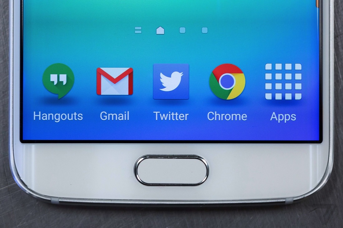
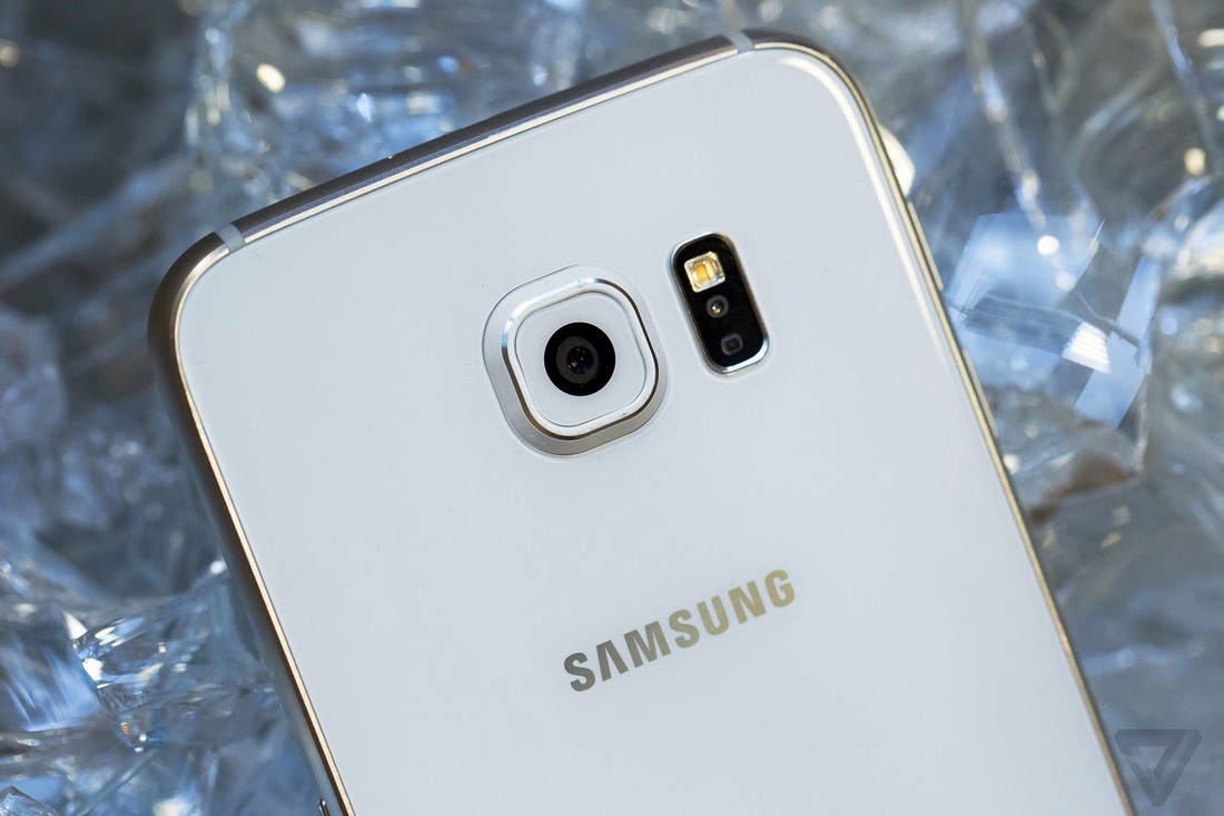
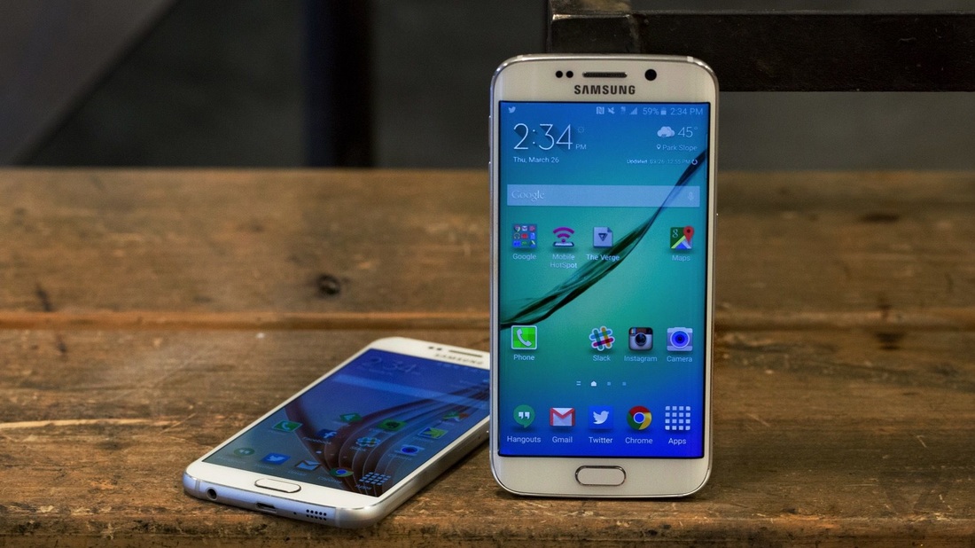
The edges are subtly textured from flat to curved in all the right spots. The seams between the glass and the metal are nigh-microscopic, and the whole thing just feels fantastic. It weighs just a hair more than an iPhone 6, and it’s slightly bigger as well. But I actually find it easier to hold and to reach the far corners because the glass is less likely to slip than the iPhone’s metal finish. It glides into a pocket and stays in my hand.
Then there’s the elephant in the room: it really does remind you of the iPhone. This isn’t a straight rip, of course. From the front, it’s the spitting image of the Galaxy S5. The back is glass, and the curves fit Samsung’s traditional Galaxy shape instead of iPhone’s rounded rectangle. But take a look at the bottom of each phone: You’ll find the same perfectly machined holes and ports in basically identical spots. Samsung also dropped the removable battery, the microSD storage expansion, and even the waterproofing, all in the name of design.
It’s actually remarkable to see a Samsung device where design feels like it was a consideration from the start, not something applied only after the component list was compiled. Go ahead and have your battles about which is better, who copied who, and even whether it’s worth losing that traditional Samsung removable battery. While you’re doing that, I’ll be over here enjoying this elegant and refined device.
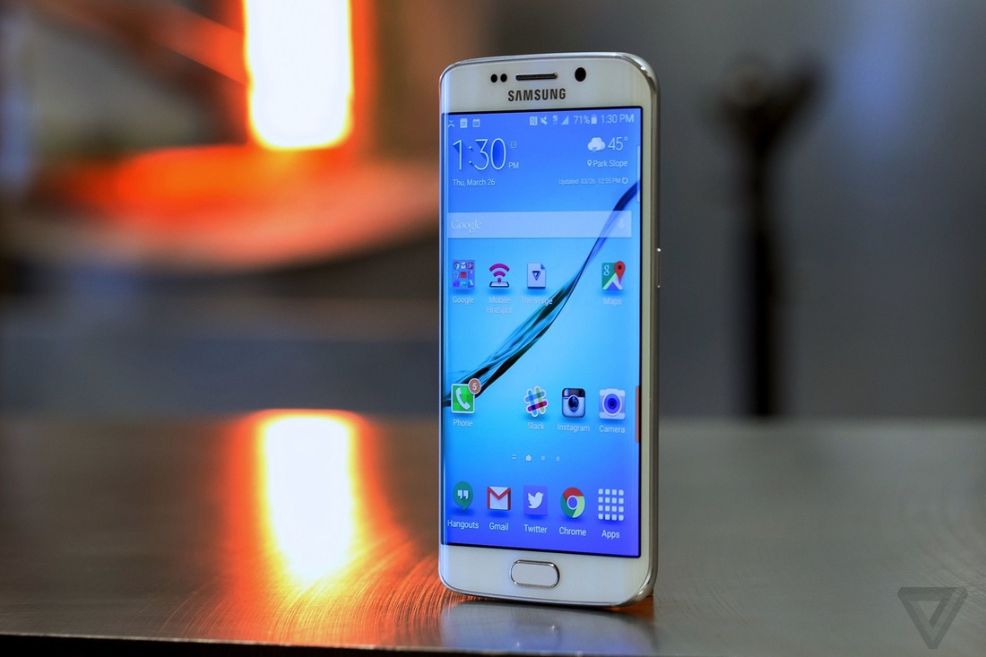
The Galaxy S6 has one of the finest screens I have ever seen on a phone. It’s a 5.1-inch Super AMOLED display with a completely unnecessary number of pixels, 2560 x 1440. Forget any gripes you may have heard about AMOLED screens in the past; they don’t apply here. By simply throwing a pixel density of 577 PPI and the processing power necessary to move light through them, Samsung has overcome any complaints with brute force. And also with better color awareness: whites are whiter, blacks are blacker, colors are vibrant without being oversaturated.
At oblique angles, it’s not as accurate as the traditional LCD you’ll find on an iPhone, and it doesn’t sit quite as close to the surface of the glass. But when you’re looking straight on, everything is ridiculously sharp. There’s also a huge gamut of brightness, from eye-searing to safe to read in bed, and the auto-brightness is actually useful.
Unfortunately, it’s not much more than that.
Samsung has added a few software tricks to go along with the curved screen. You can set a row of colored, favorite contacts that you can swipe to see. When one of those contacts calls you and your phone is face-down, the table lights up with the appropriate color. There’s a night clock that’s inexplicably limited to working for 12 hours a day. Lastly, there’s the "Information stream," which will give you the time, notifications, weather, and a random Yahoo News headline. That last feature is super slow and buggy, and the gesture to bring it up is really hard to get right.
In bright light, I’m hard pressed to find anything major to complain about. In low light, pictures tend to come out a little more yellow than I’d like, and it can be pretty aggressive in lightening things up too much. Yes, you see artifacting when you zoom in on the results, but not enough to bother me. And in some cases, I actually preferred the lighter images that Samsung put out to what I got with the iPhone 6 Plus.
The Galaxy S6 has a 2,550 mAh battery, and the S6 Edge, oddly, rates 2,600 mAh. That’s smaller than the S5’s battery, yet it needs to power many more pixels — so I suppose it’s a testament to both Lollipop and Samsung’s processor that it lasts as long as it does. It also helps that Samsung is supporting both major wireless charging standards in one body and rapid charging via USB. That’s all nice, I suppose, but it’s small consolation when you’re away from a plug and running out of juice.
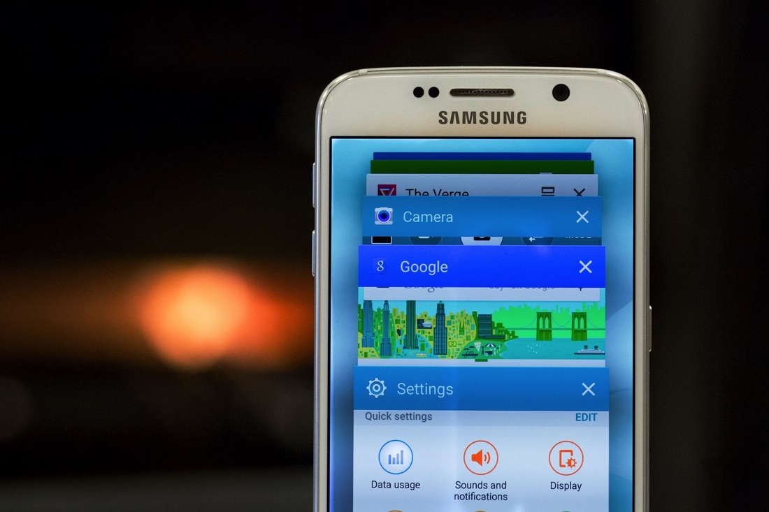
On the software side, Samsung is continuing its long journey toward a genuinely clean and restrained design. But it’s doing so by taking all of the clutter and stuffing it into the closet. The crazy Samsung features are mostly still here, just buried and turned off by default. I’m fine with that: the result is a lot of nicer rooms to live in. Samsung has mostly deferred to Google’s Material Design sensibilities, which is a refreshing change of pace. I still wish that Samsung would use more restrained colors, though. There’s also a new theming option and store, but the stuff you’ll find there is the stuff of a bad LSD trip when it isn’t a blatant co-branding ploy with an action movie.
Unfortunately, there’s still carrier-incentivized crapware apps to contend with. My review units come from T-Mobile, which meant that Lookout Security and T-Mobile carrier junk took up half my notifications until I managed to turn them off.
But you can’t treat that list of "has to's" as a checklist. Design isn’t a checkbox, and it’s more than how a phone looks or feels. It’s the whole thing, integrated, so you almost can’t imagine it any other way. We’ve heard Apple espouse these maxims so much that they’ve passed beyond the realm of cliche into proverb. You can’t help but feel like they're just empty words, a glossy sheen to distract you from the incredibly complex and multivarious innards of the modern smartphone.
Samsung finally copied the right thing: caring about design.
