We started with the basics, removed ornamentation, and flattened the icon. And we arrived at a brighter, flatter option — but was it better? Would we feel the need to do this again in a year?
Since these early "flattening" explorations lacked the visual weight of the original, we turned our focus to figuring out exactly what people loved about the classic icon and how we could carry that over. Anecdotally, we knew that people loved the rainbow and the camera lens was a key visual element. As a part of our process, we also asked people at the company to draw the Instagram icon from memory in 5 seconds. Almost all of them drew the rainbow, lens, and viewfinder.
|
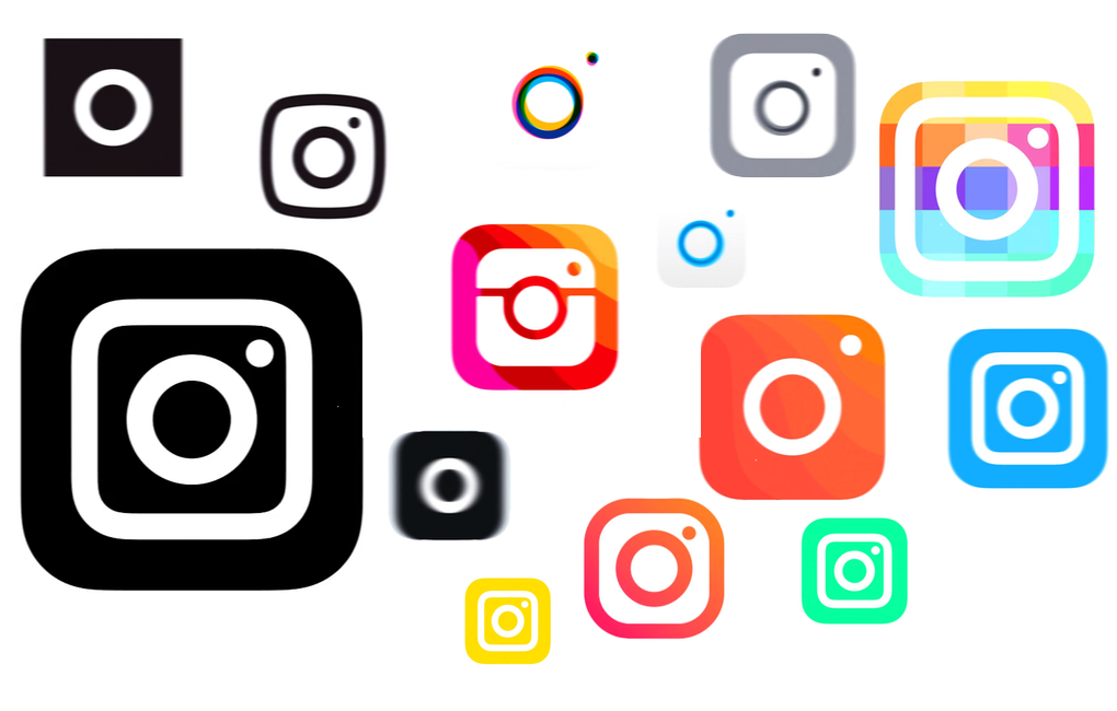
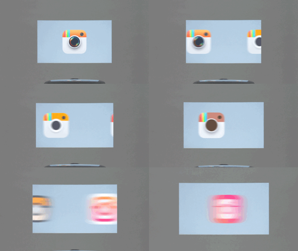
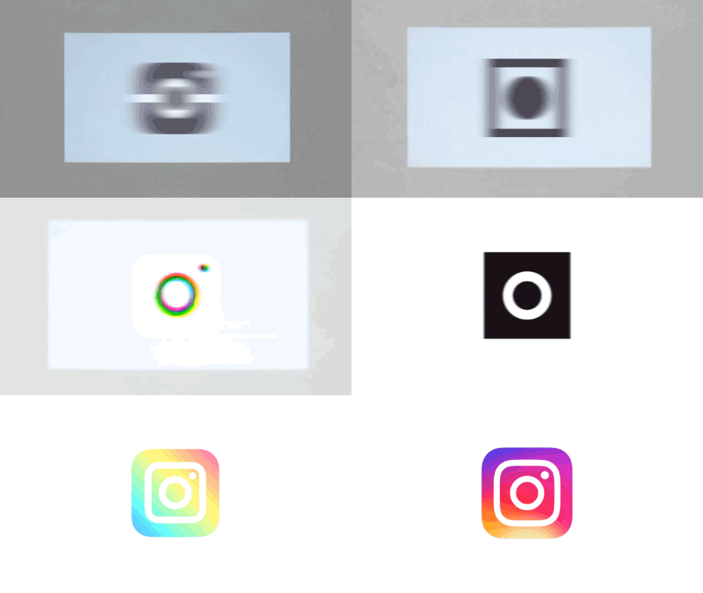
Instagram introduced a brand new icon and really nice black and white app redesign today. In the case of the icon, it's one case where the word "finally" is truly justified; Instagram spent years holding onto its iconic emblem and ignoring the modernized design guidelines of Android and iOS, where flatter and more colorful icons now rule the day. There's a post over at Medium written by Ian Spalter, Instagram's head of design, explaining how the company arrived at the new icon. "Last year, a group of us started digging into how we could support this evolution while staying true to Instagram’s heritage and spirit," he writes. "We wanted to create a look that would represent the community’s full range of expression — past, present, and future." Spalter and his team recognized that it was time to move away from the old icon's skeumorphic style. The whole thing is a fascinating read on changing something that's instantly recognizable to millions of people around the globe. That's some real pressure! And already, it seems like you'll either love or hate the new icon with not much room for a "meh" in between. It's colorful! But is it amateur Photoshop? Either way, if you scrub through Instagram's video on the new icon, you'll see some other mockups fly by. Some of them follow the app's change to black-and-white. Others encroach a little too closely on VSCO Cam territory. And then some of them are just bad. But maybe there's one you would've preferred? It's not like it matters; the decision has been made — probably after some intense debate. I asked Spalter over Twitter whether these were all actually considered by the team, and he said that hundreds of possibilities were looked at. We're only seeing a "small sample." My own personal favorite is probably this one:
|
HeadlinesArchives
May 2016
Categories
All
|
